Navigation

Entries in conference (5)

Monday
Jul022012

IDSA Educators' Papers On Line!

I may be revealing my geek side here, but as a past IDSA Education VP (and as such, responsible for putting on two educators' conferences and overseeing the peer review process of the content) I am thrilled to see IDSA's new gallery of educators' papers on line. I've attended these conferences for years and perhaps the best-kept secret in the design world is the IDSA National Education Symposium. Every year I hear something that directly helps either my professional or teaching practice. On the "big stage" of the IDSA National Conference we might see showy keynotes from well-known figures (and if they're designers, that might be a show of their portfolio, and while I'm not complaining, this can be a little ho-hum and nothing-new-here, I'm just sayin'...). The real depth and weight can often be found in the educators' sessions, but these are thinly attended by the main audience. 

Is there a misconception about design education? Perhaps. For as long as I can remember, professional practitioners have complained that design education is slipping, ineffectual, just not preparing students for the so-called "real world." This used to bother me. From my perspective, teaching at Art Center and every year looking at the work of students and educators at schools like Cincinnati, CCS, San Jose State and CCA, I see the opposite. I was told by educators older and wiser than I that this is typical of many designers - the minute they graduate they start complaining that design education isn't the way it used to be when they were in school. To these folks, I'd like to suggest that they visit one of the aforementioned schools and subject themselves to today's packed-full curriculum. The longer they've been out of school, I'd suggest they'd find greater difficulty in handling everything that we ask of students today in these programs.

The heart of the problem might be that most designers don't see the best portfolios. The A students usually have jobs before they leave school. The next rung of students look around a bit, show their work to a few offices, and then get hired. It's the C students - and, unfortunately, graduates of weaker programs - who travel all points of the compass showing their work to everyone, and finding great difficulty getting hired. It is these portfolios that most people see.

There's another truth that might be harsher for practitioners to swallow - the really good students rarely apply to the weaker offices. If your office has a reputation for being a terrible place to work, odds are that there is a parallel universe of great design portfolios that you've never seen. Think that one through before you are tempted to go off about all design education.

End of rant. Back to the educators' papers online at IDSA.

Most of the time, regular attendees of the IDSA National Conference shun the educators' sessions like kids avoiding vegetables. (Could it be connected to the bad view of design education I mention above? Who knows?) But the secret (every parent knows) is to make the educator sessions (and the vegetables) indistinguishable from the regular fare. The last educators' conference I chaired was in Austin, where we experimented with integrating the educators' presentations seamlessly with the rest of the conference. I remember asking someone with a practitioner's badge whether he'd had a chance to check out any of the educators' sessions yet. He gave me a guilty look and mumbled something about needing to go to sessions that had relevance to his work. I said, "That's ok - don't worry about it. By the way, of all the sessions, which have you liked best so far?" He brightened, and named one of the educators' sessions that he'd attended, thinking it was a "regular" session. Touché.

These papers are all archived at the national office, and in the past were intermittently and incompletely available on the web site. I am so glad to see this resource in entirety, finally accessible. 

My congratulations to Kurt Howard, Ben Chisholm, and Colleen Browning, the unsung heros of IDSA's national office staff who are, bit by bit, adding gems like this to the IDSA site. Good job, folks!

Monday
Sep282009

Project Infusion, Miami

I'm back from the IDSA National Conference, Project Infusion, in Miami, and will post my impressions of some of the more interesting sessions in the next few days. Until then, we'll make do with some of the extracurricular events at the conference: Damien Vizcarra, Kevin Young, and Jung Tak of Continuum with their double-winning entry in the IBM Ultimate Derby, "Swine Flu." The design won both the race in their category and the People's Favorite award.
Money added to the car's piggy bank increased the weight and so made the car go faster. I and a number of others packed our change into it until it was full. The designers are multiplying the amount collected by ten and will donate $ 1000 to design education. Nice going, guys!
Below, Lorraine Justice, Head of the Design School at Hong Kong Polytechnic, in a round of PowerPoint Karaoke, in which she presents slides she has never seen before. This was a diversion cooked up by Tamara Christensen of Arizona State, and was great fun between sessions.


Saturday
Sep122009

Analytical Toolsets

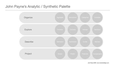
Here is the set of tools for analysis of research data that John Payne presented at EPIC 2009. He ran a workshop in which we discussed and refined this process. I was especially interested, as I had come to the same conclusion as John—that there are few who have assembled an organized and comprehensive way to analyze research results. I had begun to assemble a kit of tools of my own:

In my previous post I showed the "Tool Picker" for helping design students decide which research methods to use. The right-hand edge of that diagram containing the list of methods is shown, above. The question: after you use the proscribed set of methods in the field, how do you make sense of what you've found?

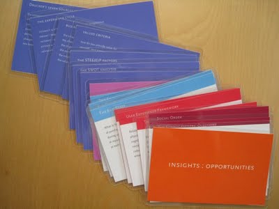
I have been putting together a set of tools gathered from my own experience and the experience of others (such as the good folks at the Institute of Design at IIT, Dori Tunstall, Lloyd Walker, Andy Ogden, among others). This is the "Insights : Opportunities" deck we've been using in my Design Investigations course. The intent is that, with the use of a variety of "lenses" through which to look at the data, the conclusions will be more robust. I've been very pleased with the results. Where before, students finished their research presentations with a single slide containing three or four bullet-point conclusions, they are now concluding with ten or twelve slides, each pointing out a viable design opportunity that derives from an insight from the research.

When I saw John's Analysis / Synthesis Palette at EPIC, I was fascinated. He is coming at the same problem from a completely different direction. I am using the metaphor of a group of individuals looking at the research data, each with a different point of view. John is looking at the process itself, and creating, in a wonderfully methodical way, different ways to arrange, sift, compile, deconstruct, and recombine the data, winding up with prescribed directions.

I will be looking over my notes for some time, to decide how I will change what I'm doing based on his approach.


Saturday
Sep052009

The Insight : Opportunity Deck

Research is worthless unless it fuels the design process. Once the fieldwork is done, we need additional tools to help us make sense of what we've got. I have been using a variant of the KJ Method (developed by Jiro Kawakita in the 60s, similar to Affinity Diagrams) for years in my course, but recently I've begun to beef up the process by which we analyze what results. I've begun to assemble a deck of analytical aids to help guide students' thinking into areas they might not automatically consider. I've found many methods in use for fieldwork and am developing an aid to reduce the complexity of navigating that decision (discussed in the previous post), but to date I haven't found many aids for making sense of the the analysis process.

In practice, designers always work in a multidisciplinary team and research findings are interpreted by a number of different specialists: designers, human factors engineers, anthropologists—the list varies according to the needs of the project. In student work and also in small design firms, those multiple viewpoints may not exist. The deck consists of lists of questions that we can "ask" the data—questions that an anthropologist might ask, or a cognitive scientist, or an engineer, or a management consultant.


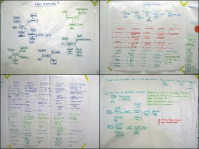
Students stand in front of the wall of data and work their way through the deck, each card acting as a lens through which they view the data. The deck is in two parts: an insight deck and an opportunity deck. The first part helps reveal important insights that might fuel design opportunities. We work slowly and methodically through the deck, making an effort to find—even force—connections between the questions and the data.


The insights are listed, mapped, or arranged in diagrams, as needed. The second deck is used to create and validate the design opportunities represented by each insight.

This process takes two or three weeks, at least. At the end, we link the insights to opportunities for design intervention, seeking quantity, quality, depth, and range: products, experiences, and business models from near term to blue sky, mild to wild. Our aim is to present our clients with a robust set of insight : opportunity pairs, hooking each opportunity to the insight that inspired it.

This is a work in process. Last week at EPIC2009 I took part in an amazing workshop with John Payne from MomentDesign, who showed us an analysis framework he's been developing, and based on that excellent session (which I hope to cover in an upcoming post) I know I will be developing this further.
I'll be presenting this work at the IDSA National Conference in Miami in a few weeks. If any of you are attending, I'd love to have the opportunity to show you more and get your feedback. See you there!


Wednesday
May062009

Serious Happiness, Serious Toy

Last January I attended a conference on Positive Psychology at Claremont Graduate University that confirms my belief that the best conferences to attend are ones outside your field. I had heard that one of my heroes, Mihaly Csikszentmihalyi, would be speaking (the author of "Flow: the Psychology of Optimal Experience" and one of the authors of "Experience Sampling Method: Measuring the Quality of Everyday Life", which reveals him to be one of the granddaddies of what we call beeper studies), and I wanted to hear him. He was scheduled for the end of the day-long seminar, and I toyed with the idea of coming late just to hear him. I am so glad that I didn't.
The entire conference was a revelation. The field of Positive Psychology is a young one but they are getting busy with the act of measuring happiness, developing a Manual of the Sanities (the opposite of the DSM, or the "manual of the insanities," as they call it), and otherwise treating dysfunction, whether individual or organizational, by focusing on what one is doing right, rather than what one is doing wrong. Being firmly rooted in academia (and most likely attacked from all sides by traditional—i.e. dysfunction-focused—psychologists), they are building an impressive body of work that proves that thesis. You can find video of the entire conference on their web site, plus a good overview of the field in this Time Magazine article.
I took the opportunity to try out my new Pulse Smartpen, a product I'd bought with the hope that it would aid me in taking notes during research interviews. 
What an amazing product. Usually these things are vaporware; this is the first product I've seen of this type that performs as advertised, with very few glitches. The pen works with paper printed in a proprietary dot pattern licensed from the Anoto Group. The dots are in a random pattern, and each area of the pattern is unique. 
Evidently, they have generated an immense area of this pattern—something like an area equivalent to the size of Europe and Russia—and have printed it out on the pages of a set of notebooks that you use with the pen. If you can imagine chopping the pattern up into page-sized pieces and printing it in notebooks, each page of which is unique, you'll get the idea of the basis of the technology.
The pen has an IR camera embedded in the tip that "sees" the dot pattern. The pen knows, then, where it is on any page of any of the eight notebooks. And just when you think, aha!, here's where they're making their money—you're hooked into buying their notebooks—it's true that you are, but the notebooks (standard spiral notebooks or 5.5 x 8.5 Moleskine-type books) cost about what the ordinary versions cost. Not a big deal.
So the pen does not actually record the image of the pen stroke; it records the location the pen is on the paper when the pressure sensor indicates that you are pressing down, i.e. writing. It's a pretty fool-proof system that records what you write by hand and stores it in the flash memory in the pen.
You dock the pen to your computer to download the files to a companion piece of software, the Livescribe Desktop, where you can view your notes.
"Cool," you say. But wait. There's more. The pen has a microphone on it that can record audio of what's going on when you write. And it links it to what you write. So. In your notebook, on the analogue version of your notes, you can tap the pen on any part of those notes and the pen will replay the audio that was recorded. It does this on a crappy little speaker on the pen, but on the computer, when you click on the visual image of the notes with your cursor, the playback audio reveals that the mic on the pen is surprisingly good for the size of the pen, and if the speakers on your computer are good (or you're listening through a headset), you will hear surprisingly good-quality audio.
But wait. There's more. The pen comes with a headset that plugs into a mini-jack at the top end. Each earbud on the headset not only contains a speaker but also contains its own microphone. When you wear the headset while taking notes, the pen will record binaural, stereo audio. The playback, if you listen through the headset or through any headset connected to your computer, will give you a "you are there" experience of the event. This is seriously cool. Knowing just enough about brain science to make me dangerous, I can imagine that a learning-disabled child, taking notes with the pen and headset in school, can replay the notes later and hearing the stereo recording will enable him to better recall the experience of the teacher's lecture, hence enabling better incorporation of the knowledge. Just a theory, but I'm sticking to it. At the very least, the high-quality binaural audio puts me back into the conference in an immersive way, which I know helps my recall of the event.
They call these recordings linked to notes "paper replay" sessions, and there is a community web site where one can upload paper replay sessions for others to access online. I haven't experimented with this part of the system until now (I've only looked around at some of the recorded sessions that others have uploaded there). They just added the ability to embed sessions into blogs, so I'm trying it out. Here goes.
This is a 7-minute session of Martin Seligman's introductory remarks at the Claremont Positive Psychology conference. I recorded this with the headset, and if you listen to it with headphones, you'll see the quality of the binaural audio. Pretty darned cool.
Oh. By the way. Click with your cursor anywhere on the greyed-out notes and you'll skip instantly to that part of the recording. This is immensely helpful for reviewing longer talks, like this one:
This one is a longer recording, but an interesting one. I recorded it at Art Center College of Design's 2009 Summit, a small conference we hold each February on the topic of sustainability. This talk is an example of why I like this little conference—it attracts a wide variety of presenters on a number of interesting topics, in this case Col. Jodine Tooke, who is talking about how the US Air Force is keeping us safe from Cyberterrorism. Pretty darn cool as well.
And speaking of the length of the recording, you can see how, by clicking anywhere on the image of the notes you can skip to that part of the talk. This makes listening to a longer talk much easier—you can navigate around within it in an intelligent way (as long as the notes I've taken are intelligible to you, which they may or may not be... sorry). This is a marked improvement on merely listening to an audio file, where your only option is to scroll forward or backward, without knowing where you are "landing."
This second recording is an example of what is captured without using the headset—just recording with the mic in the pen. Not bad at all, although you'll note that it's a monaural recording.
In sum, I'm very happy with the pen. In the past, I've recorded using a Belkin mic attached to my iPod, making note of the time signature in my notebook whenever the speaker says anything interesting, so that I'd be able to cut straight to that part of the recording later. With this pen, the linking of written notes to recorded audio is automatic.
The only glitch that I've found is that not all of my pen strokes are captured, which you can see in the first example, above. I was writing more slowly in the second example, and so (while my handwriting is atrocious, sorry) you can see the complete words.
My friends who are designers are not happy that the pen strokes are recorded as lines of consistent width. They would like the dynamic quality (thick, thin) of the line to be captured. To them, I say, This is not a Wacom tablet. Get over it. It would, however, be an easy way to record simple sketches (the files can be saved three ways: as linked Paper Replay sessions, as JPEG files, and as AIFF sound files) and get them into a layer in Illustrator or Photoshop to use as an underlay. You can buy unlined Moleskine-type notebooks with the dot pattern only, which would make this easy.
All in all I'm pretty happy with the pen, and it's made accessing my notes much easier than before. I used to attend conferences and take copious notes that I'd rarely look at later. I find that I'm accessing what I've written much more often now.