Navigation

Entries in qualitative research (4)

Sunday
Apr262020

River Journey Deck

This is a mockup of a deck that uses the metaphor of a river to tell a story of a journey. The main path of the story is represented by cards representing segments of a river, with obstacles, smooth patches, stagnant pools, motor boats, and other features along the way. The picture cards can be used to add detail to parts of the journey and portray common metaphors or actions—an idea, angel wings, a seeing eye, a snake, and so forth.

A variant of this idea was used successfully by one of our alumni for research interviews describing participants' journey to wellness for the health care industry, and I'm hoping this will be a useful generative tool for qualitative interviews.

I am testing these cards on two types of material—regular and plastic playing-card stock. I am hoping that the plastic material can be written on with fine-point dry-erase markers. I'm providing five blank white cards so that participants can create their own cards if needed. If the plastic material is of good quality and can be a "write on, wipe off" surface, then this will be possible and the deck can be used for multiple interviews.

The printer I am using has a "marketplace" option on their web site that I plan to use if the deck turns out well—for both this deck and my Archetype Deck described in an earlier post. I continually have requests from colleagues, students, and alumni for copies of these decks, and this might be a way to make them available. We'll see how it goes. I should have the two samples in about a month.

Monday
Oct192015

Experience Sampling with Smartphones

We tried something new in ID Research last week. I've long wanted to do "beeper studies" using smartphones and the simple capabilities of text messaging - texting participants and asking them to provide a brief description of what's happening in the moment, plus a snapshot. 

This is an old method that allows researchers to collect "samples" of everyday experience that would otherwise be difficult to capture. It was done using beepers back in the day, hence the name Beeper Studies.*

There are ethnographic research apps available that can be used for this, but I wanted to see if we could do it simply and without having people buy a special-purpose app. Using the class as our participants, my TA, Jeff Lin, texted them at various times of day for a week and asked them to text back with a rating of how stressed they were in that moment, along with a brief description and a photo of what they were doing.

We compiled all of the samples into a matrix and viewed the results - a picture of one week in the life of fifteen ArtCenter students. The method worked pretty well. We have a few notes on what we will change the next time we do this, but I think I'll add this to our list of generative tools.

*  For more on Beeper Studies, you really should try to find a copy of the book, "Experience Sampling Method," by Mihaly Csikszentmihalyi and others. He is one of my research heroes, and every designer should have a copy of his book, "Flow: The Psychology of Optimal Experience" on their shelf. Here's a link to his TED talk, on the topic of Flow.

Saturday
Aug012015

The New Archetype Deck

Just got the finished Archetype Deck that I will be using in a workshop at the IDSA National Education Symposium in a couple of weeks. It should be great fun for all. We'll be using this tool to conduct research during the conference.

I've been using a deck like this for a while, but without original art. Thanks to talented Art Center illustration alumna, Tiffany Hayashi, and her equally talented colleague Victoria Liwski, we now have our own deck. I've added a few archetypes to Jung's original twelve, creating a generative tool that is effective to fuel discussions about a variety of topics.


Friday
Sep042009

Designing Design Research

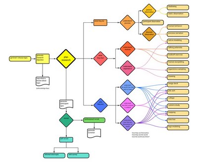
By way of an explanation for why I haven't posted lately, this last term was consumed by two projects: finishing the plan for what I've come to call the "tool picker" (above) to help designers new to qualitative research expand their palette of methods, plus a set of analytical tools to use on the research data.
This, on top of a term of research for a multi-term project for the American Red Cross, kept me busier than a dot painter in a paisley tie factory. I'll post more on all of this in the upcoming weeks.

The so-called "tool picker," above, is an attempt to help designers explore beyond a set research methodology. As currently taught (and sometimes practiced), design research is often treated as a constant set of tools and, as a result, students tend to think that it's a standard process. The field of design research has evolved into a complex landscape of approaches, however, and good design practice stays abreast of these developments.

In order to help my students break out of a narrow approach and yet negotiate the complexity of the myriad methods in practice today, I am attempting to acquaint them with a comprehensive and yet manageable set of methods. Also, I need to equip them with an understanding of why, and in which situations, a particular approach would be effective.

Currently, the research approach is chosen by those with expertise. There is a "guru" who brings years of experience to bear on the decision. Is there a way to enable beginners to more quickly gain the experience necessary to know which approach might be best for a given problem?

I distilled the complex set of approaches in use today into a set of eighteen (you see them down the right-hand side of the diagram, above). I will be creating a decision-making tool to guide the students through the decision process by asking a series of questions about what type of knowledge they seek for a given topic.

Starting at the left-hand side with a careful choice of topic, students are asked to generate a research objective statement. We discuss issues of ethics, scope, appropriateness, and so forth, and gain explicit knowledge of the researcher's bias.

Moving on to the decision process (while at the same time generating specifications of which sorts of participants will be recruited and engaging in the recruitment process), students begin to consider the type of knowledge they seek. We consider three general areas of knowledge about the user: what they do, what they feel, and who they are. Moving right-ward through the diagram, you can see how we move into finer levels of discrimination, arriving at a recommended set of methods.

This is a first rough design for the tool. When I first completed this version, I was disheartened at first by seeing that, if one worked backwards through the chart one could see that a skilled researcher could use any of the tools to uncover any of the types of knowledge desired. But I reminded myself that this is a decision tree that helps beginners and widens their view beyond a limited single-thread process. The tool is designed to lead them to the most appropriate choice, by no means the only choice possible. Once they've used the tool for a few projects, they will begin to gain knowledge of the wider set of approaches and begin to see how the different methods work in different cases. Once they begin to see that the tools actually can be tailored to many purposes, they are right where I want them: imbued with a robust working knowledge of the multivariate research process.